Witamy na odświeżonej stronie feerum.pl. Mamy nadzieję, że poruszanie się po niej będzie dla Państwa przyjemnością a odnalezienie potrzebnych informacji znacznie prostsze.

Welcome to the refreshed feerum.pl website. We hope that moving around it will be your pleasure and finding the information you need much easier.
In the last few years we have changed a lot and we wanted it to be reflected also on our website. Hence the new logo and the entire visual identity system.
A new creative line
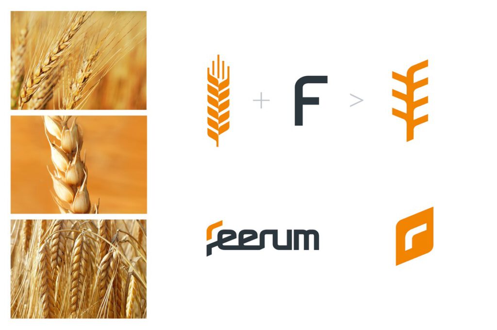
On a daily basis, we implement comprehensive drying and storage teams, consisting of silos, a wide range of dryers and reliable grain transport systems. We are present in 12 countries, in Europe and Asia. We wanted the new visual identity system to be modern, global, but at the same time unique not only in the agricultural industry. Graphics in the form of ear of grain has been simplified so that you can enter in it the letter “F” referring to the company name. We have given up the entry “S. A. “in the logo, because it was incomprehensible to many of our foreign customers and contractors.
Maturity and ambition
The colors used in the new logo are not accidental. We were looking for colors that will attract the attention of our customers, but at the same time reflect the values and characteristics of FEERUM. We chose orange as an expression of our commitment, passion, care for the quality of every FEERUM product and determination in striving for perfection. FEERUM is a stable company with an established position on the market, we are characterized by maturity and experience, a reflection of this is graphite color.
We’re back like a boomerang
We are not afraid of challenges or difficult tasks. And although the previous logo has accompanied us for over a decade, we believe that the new logo and signet ring will be welcomed both at home and abroad.
– In the new logo I liked the idea of the signet most. I missed one sign so far, with a simple message that would mean – “this is FEERUM”. The sign also contains one additional information. Part of the letter “F” is nothing but a boomerang. FEERUM is like a boomerang. We often come back to our clients. After many years, we are expanding facilities or introducing better, technologically advanced solutions – says Daniel Janusz, president of the board of FEERUM S.A. and author of the concept of the company’s first logo.
The new website www.feerum.pl in addition to the full product portfolio also includes an updated list of FEERUM investments implemented in Poland and around the world. The service has been adapted to the requirements of mobile devices.


